Responsive web design is rapidly becoming the norm for all websites in the digital world. Along with quick speed, eye-catching design, and strong features, responsiveness is essential for a website to capture the attention of its target audience. Smart web design prioritizes user experience while portraying a strong brand image. To create the correct perception, your website is the initial point of contact between you and the consumer.
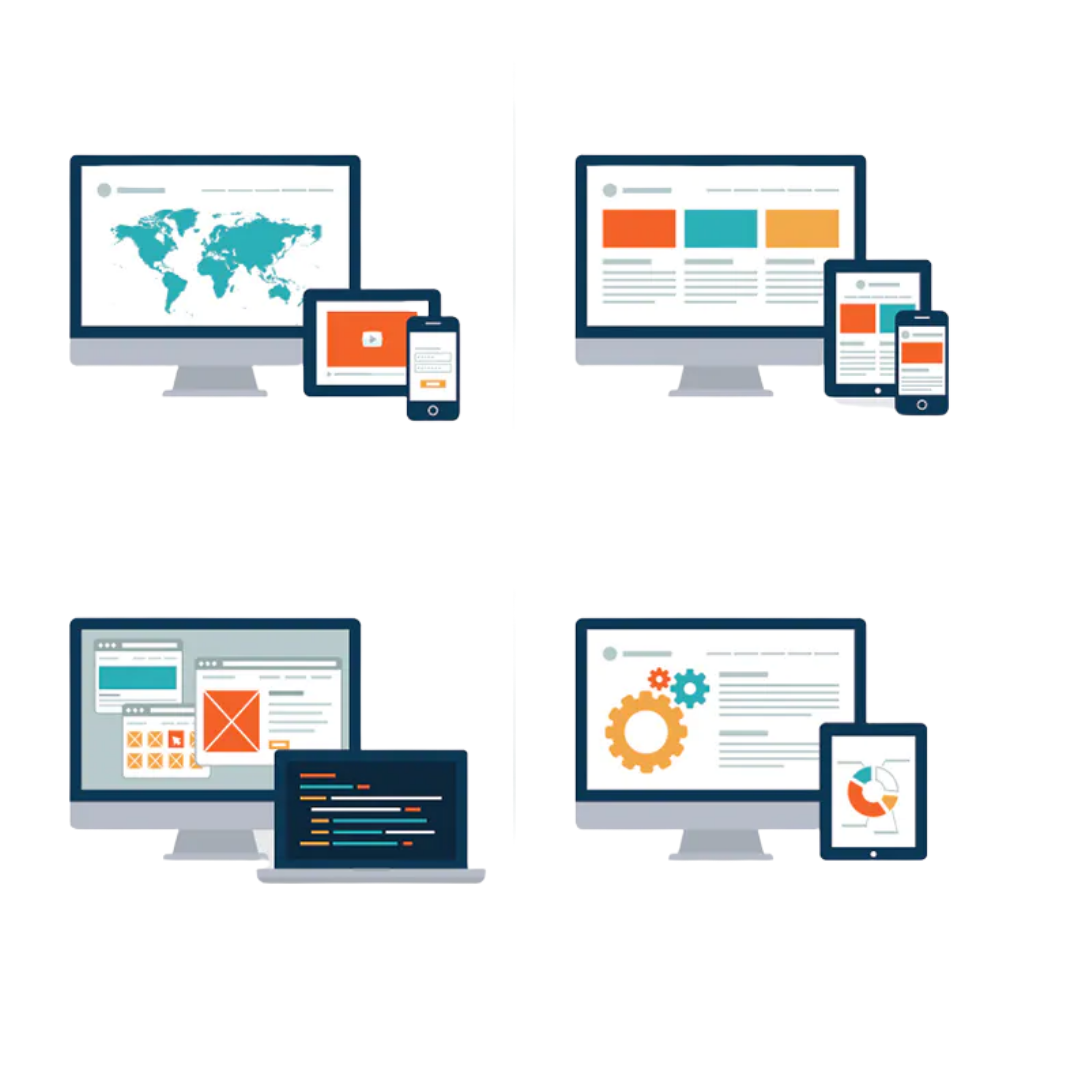
The idea of responsive web design proposes that style and development ought to react to the user’s behavior and surroundings supported screen size, platform, and orientation. It means designing one’s website specified it flows seamlessly from desktop to mobile, tablets, wearables, IoT, and alternative devices to suit the device that they’re being viewed. This prevents the pages from rendering larger than the device’s height and dimension.
The effectiveness of responsive web design:
In this world, with fierce competition, nobody would like to stay behind and do nothing for one’s business. That’s why one needs to upgrade their website with the changing technology in this dynamic business environment to keep up with the race.
But keeping up with the race is not sufficient, one must stand out from the crowd to showcase that their brand is different from others. This is possible only with the help of responsive web design developed to automatically adjust to any screen size, providing website visitors with the best viewing experience regardless of the device they are using.
The Importance of Responsive Web Design:
- A More Pleasant User Experience
The user experience must be prioritized by website owners. You want visitors to like your site, and you want it to be simple to use so that they will return. If a customer approaches your website on a mobile device and it takes an eternity to load or your images are low-resolution, it may give the impression that your company is unprofessional.

- Better SEO rankings
Responsiveness can help you get a significant advantage in search engine rankings.
Google considers the responsiveness of all websites as one of the factors that influence their ranking in search engine results. This simply implies that if your website is not responsive, it will be ranked lower in search engine results.

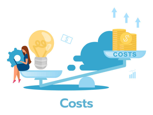
- Cost-Effectiveness
To appeal to all visitors and devices, you will just need to invest in a single site design. One may save money by not having to pay for a mobile site if you use responsive web design. Another advantage of a responsive website is that it requires less maintenance than maintaining two versions of the same website.
- Boost to brand image
A responsive website that is easy to access and navigate appeals to everyone. Thus leading to a boost in one’s business and brand image. All you have to do is invest in a responsive web design that leads to fruitful results in the future.

- Easy maintenance
Most businesses don’t have much time to update and upgrade their current website looks and they neither want to hire someone every time for such things. But with the help of responsive websites, they can solve this problem by themselves.

Tools to make a responsive web design:
- CMS hub
- WordPress
- Squarespace
- Wix
Best practices for responsive web design to focus on:
1. Don’t neglect buttons- Call To Action (CTA) must be easy to find
2. Consider typography – Font style and size.
3. Responsive Imagery- Make sure your images scale.
4. Use scalable vector graphics.
5. Testing on all devices
Conclusion
In comparison to desktops and laptops, mobile devices are being used by more individuals to access the internet. As a result, your website must appear fantastic and function properly on tablets and smartphones as well as desktops and laptops.
Unlike isolated mobile websites, which necessitate the development of a separate version of a website for mobile devices, responsive design adapts the layout to any screen size by utilizing CSS fluid, proportion-based grids. Responsive websites provide the same HTML to all devices and use CSS media queries to customize how your website appears on each device.
If your website design isn’t yet responsive, it’s high time to seek web design advice and adapt it to be more responsive.

